Color Theory: How to Choose Paint Colors To Suit Your Interior Design Style
The color wheel, which consists of primary, secondary, and tertiary colors, serves as the foundation of color theory. Warm tones like reds and yellows can create a sense of energy and vibrancy, while cool tones such as blues and greens can induce calmness and tranquility.
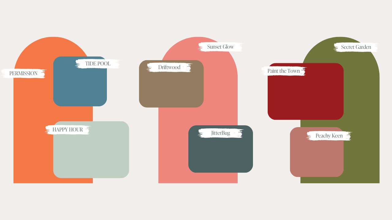
Color schemes are examples of how these colors can be combined to achieve different effects. The careful selection of colors in interior spaces can greatly influence an individual’s mood, productivity, and overall well-being. In this guide we'll talk about three different types of color schemes: Whether it’s creating a cozy bedroom retreat or a lively communal area, understanding and applying color theory in interior design allows designers and DIYers alike to craft environments that resonate with occupants on a emotional level. Whether you’re drawn to the classic elegance of Tide Pool and Permission, the timeless charm of Paint The Town and Secret Garden, or the regal beauty of Sunset Glow and Driftwood, Country Chic Paint provides a palette that transcends the ordinary. With each color thoughtfully designed and inspired by the magic of complementary pairings, finding the perfect combination for your interior space becomes an exciting journey. Experiment with the versatility of our collection, allowing you to test, blend, and harmonize until you discover the ideal complementary colors that resonate with your unique style and evoke the desired emotions in your home.
Types of Colors
Primary Colors

Primary colors are made up of just three colors: red, yellow, and blue. These three colors are then mixed to make every other color in the rainbow!
Secondary Colors

Secondary colors are created by mixing primary colors together. The secondary colors are orange, green, and purple.
Tertiary Colors

Tertiary colors are made by mixing a primary color with a secondary color. These combinations result in colors such as orange/yellow, red/purple, and green/blue.
Warm Colors vs. Cool Colors

Warm colors
These consist of red, orange, yellow, as well as combinations thereof. As the name indicates, they tend to make you think of warm things such as sunlight and heat.
Visually, warm colors look as though they come closer or advance, which is why they’re often used to make large rooms seem cozier.

Cool colors
These are typified by blue, green, and purple. They can calm and soothe. Where warm colors remind you of heat and sunshine, cool colors remind you of water and sky, or even ice and snow.
Unlike warm colors, cool colors look as though they recede, making them great for small rooms that you want to make appear larger.
Colors and Their Meaning

Red, a color synonymous with passion and vibrancy, plays a dynamic role in interior design. Its bold and warm qualities make it particularly well-suited for social spaces like dining areas and kitchens, fostering lively interactions. In bedrooms, touches of deep red can introduce a sense of romance, while in workspaces, it sparks creativity and energy.
Try one of our reds!
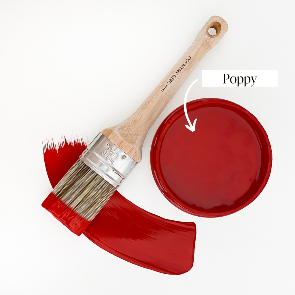
Poppy

Paint the Town
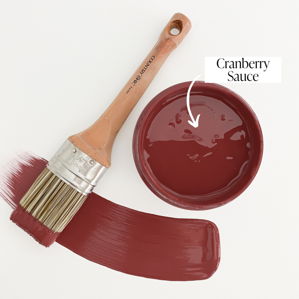
Cranberry Sauce

Orange, a lively and adaptable hue, infuses warmth and playfulness into interior spaces. Symbolizing enthusiasm, it creates a cozy ambiance in social areas and fosters creativity in home offices. Tangerine accents in bedrooms add vitality without overwhelming the space. Whether used subtly or boldly, orange brings a dynamic and cheerful aesthetic to different corners of the home.
Try this bold, orange color!

Persimmon

Yellow, echoing the warmth of sunlight, brings joy and optimism to interior spaces. Perfect for social hubs like kitchens and living rooms, it fosters positivity and energy. Soft yellows in bedrooms create a serene and cheerful ambiance. Whether used subtly or boldly, yellow infuses spaces with the vibrant spirit of sunshine, promoting a visually pleasing and optimistic atmosphere.
Try one of these yellows!
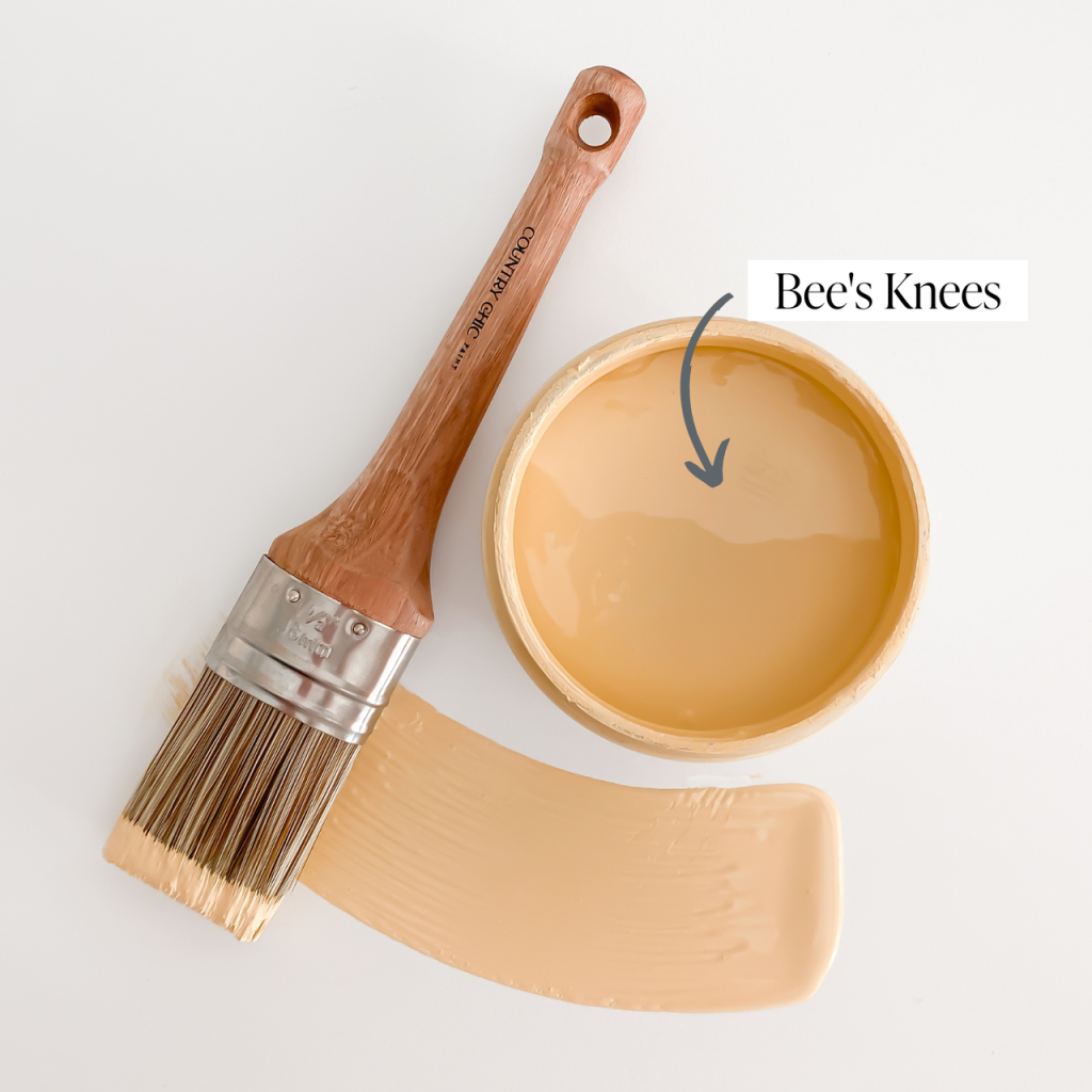
Bee’s Knees
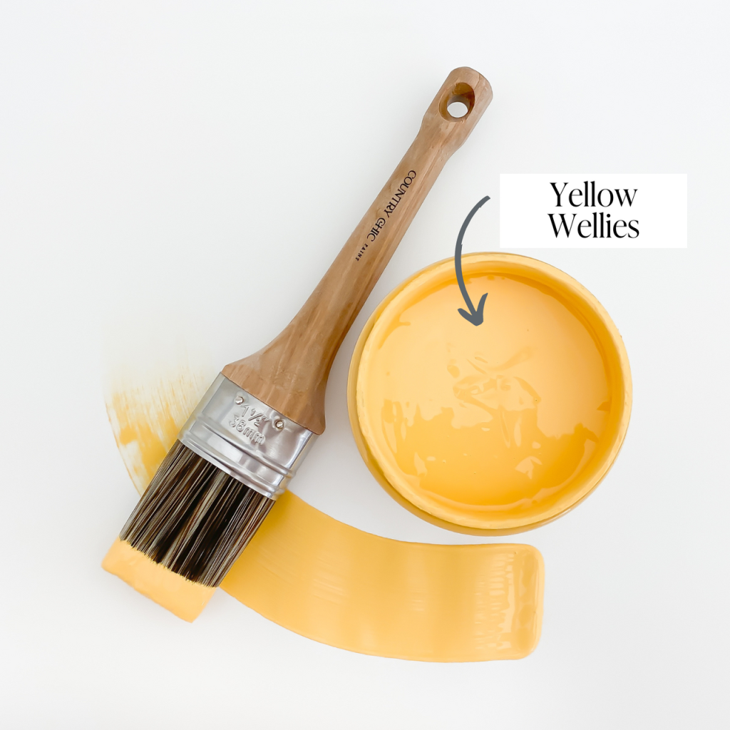
Yellow Wellies

Fresh Mustard

Green, mirroring nature’s serenity, becomes a versatile force in interior design. Symbolizing growth and harmony, it creates a calm ambiance ideal for bedrooms and living rooms. Whether through plant accents, furnishings, or walls, green brings a refreshing touch, infusing spaces with natural beauty and balance.
Try one of these greens!

Happy Hour

Dune Grass

Sage Advice

Secret Garden

Fireworks

Hollow Hill
Blue, a versatile and soothing color, plays a central role in interior design, creating a calm and sophisticated ambiance. Symbolizing serenity and depth, blue is ideal for bedrooms, bathrooms, and living spaces. From subtle accents to bold statements, the various shades of blue evoke timeless elegance, transforming spaces into havens of relaxation and refined style.
Try one of these blues!
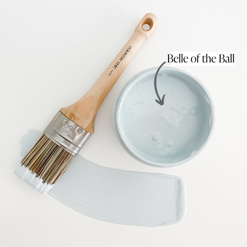
Belle of the Ball
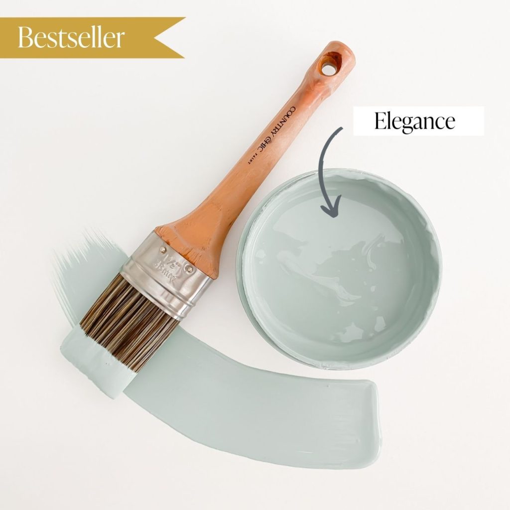
Elegance

Nightfall

Tide Pool
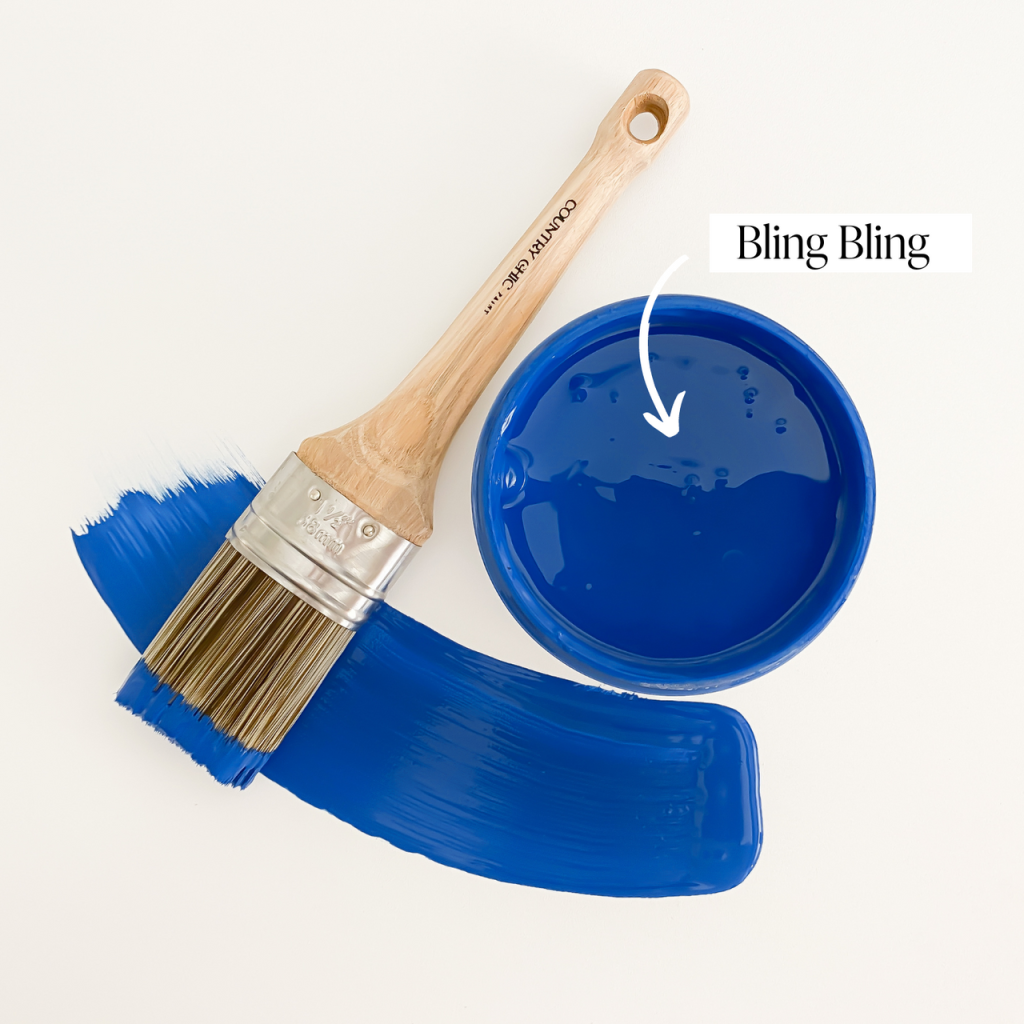
Bling Bling
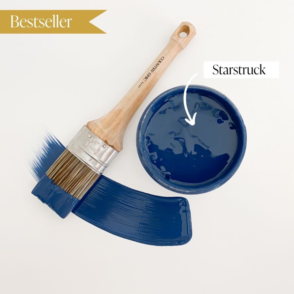
Starstruck
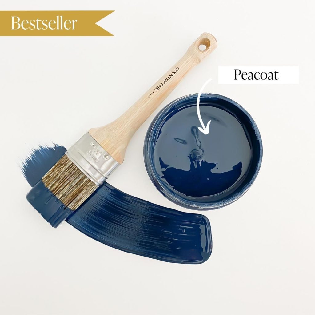
Peacoat

Jitterbug

Whoop-de-do

Tropical Cocktail

Purple, a symbol of luxury and sophistication, brings a regal and mysterious allure to interiors. Ideal for bedrooms and creative spaces, purple, whether in rich tones or soft pastels, adds drama and refinement. Join us as we explore how this majestic color elevates the ambiance, infusing spaces with a sense of grandeur and creative inspiration.

Brown, embodying natural warmth, adds timeless charm to interiors. Symbolizing stability, it finds prominence in living spaces and kitchens. Whether through wooden elements or rich textiles, brown hues bring comfort and grounding, creating inviting atmospheres with nature-inspired elegance.
Try one of these browns!

Soiree

Road Trip

Driftwood

Leather Bound

Dark Roast

Black, a symbol of sophistication, adds bold elegance to interiors. Whether in statement furniture or accent details, black creates depth and drama in bedrooms or living spaces, providing a canvas for vibrant colors to shine. Join us in exploring how black, with its versatile appeal, elevates spaces and infuses a sense of refined chicness into every corner.
Try this true black!

Liquorice

Pink, blending playfulness with sophistication, brings a unique charm to interiors. Ideal for bedrooms and living areas, whether in soft pastels or bold hues, pink adds vibrancy and warmth. Join us in exploring how this delightful color elevates spaces with a stylish and inviting flair, infusing every corner of the home with playful sophistication.
Try one of these pinks!
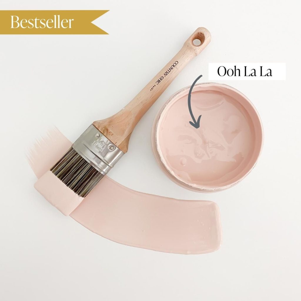
Ooh La La
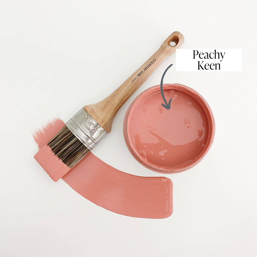
Peachy Keen

Sunset Glow
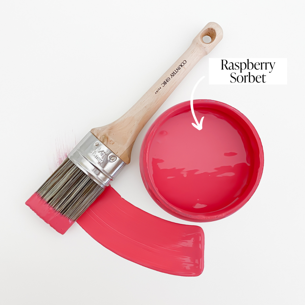
Raspberry Sorbet

Grey, a versatile neutral, brings timeless elegance to interior design, symbolizing balance and subtlety. From light hues for minimalism to darker tones for drama, grey effortlessly complements colors and textures. Join us in exploring how grey’s understated charm elevates spaces, offering a canvas for both classic and contemporary expressions.
Try one of these greys!

Lazy Linen

Sunday Tea

Pebble Beach

Cobblestone

Hurricane

Rocky Mountain

White, a symbol of purity and simplicity, radiates timeless elegance in interior design. As a versatile neutral, it serves as a blank canvas, offering endless design possibilities. Whether as the main color or an accent, white brings openness and brightness to interiors, creating an atmosphere of pure sophistication.
Try one of these whites!

Simplicity

Crinoline

Vanilla Frosting

Cheesecake
Complementary Colors
Complimentary colors (positioned opposite each other on the color wheel) are pairs that when combined, create a striking visual balance. Harnessing the magic of complementary colors in interior spaces allows designers to craft visually appealing environments that captivate and engage. Whether it’s the calming union of blue and orange in a living room or the invigorating contrast of red and green in a kitchen, these pairings add depth, interest, and a touch of sophistication to every corner.
The magic of complementary colors lies in their ability to intensify each other when combined, elevating the overall aesthetic of a room. Designers strategically leverage these pairings to draw attention to focal points, highlight architectural features, or infuse spaces with a captivating and cohesive palette. Whether aiming for a bold, contrasting look or a more subtle fusion of tones, understanding the synergy of complementary colors empowers designers to transform interiors into visually stunning canvases that resonate with energy, balance, and a touch of artistic flair.

Green and Red
Red and green are opposite each other on the color wheel, creating a high-contrast combination that draws attention.


Orange and Blue
The coolness of blue complements the warmth of orange, creating a visually engaging and balanced palette.


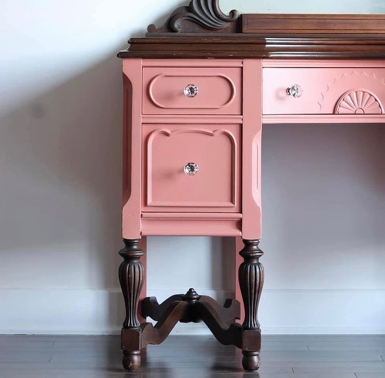
Pink and Brown
The softness of pink is complemented by the earthiness of brown, creating a gentle and pleasing contrast that evokes a sense of natural beauty and warmth.

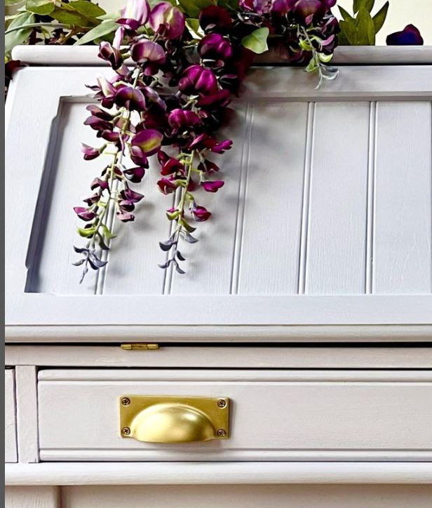
Grey and Black
Grey serves as a neutral backdrop, allowing black to stand out while maintaining a sense of balance. These two shades are an elegant and sophisticated pairing that is timeless.


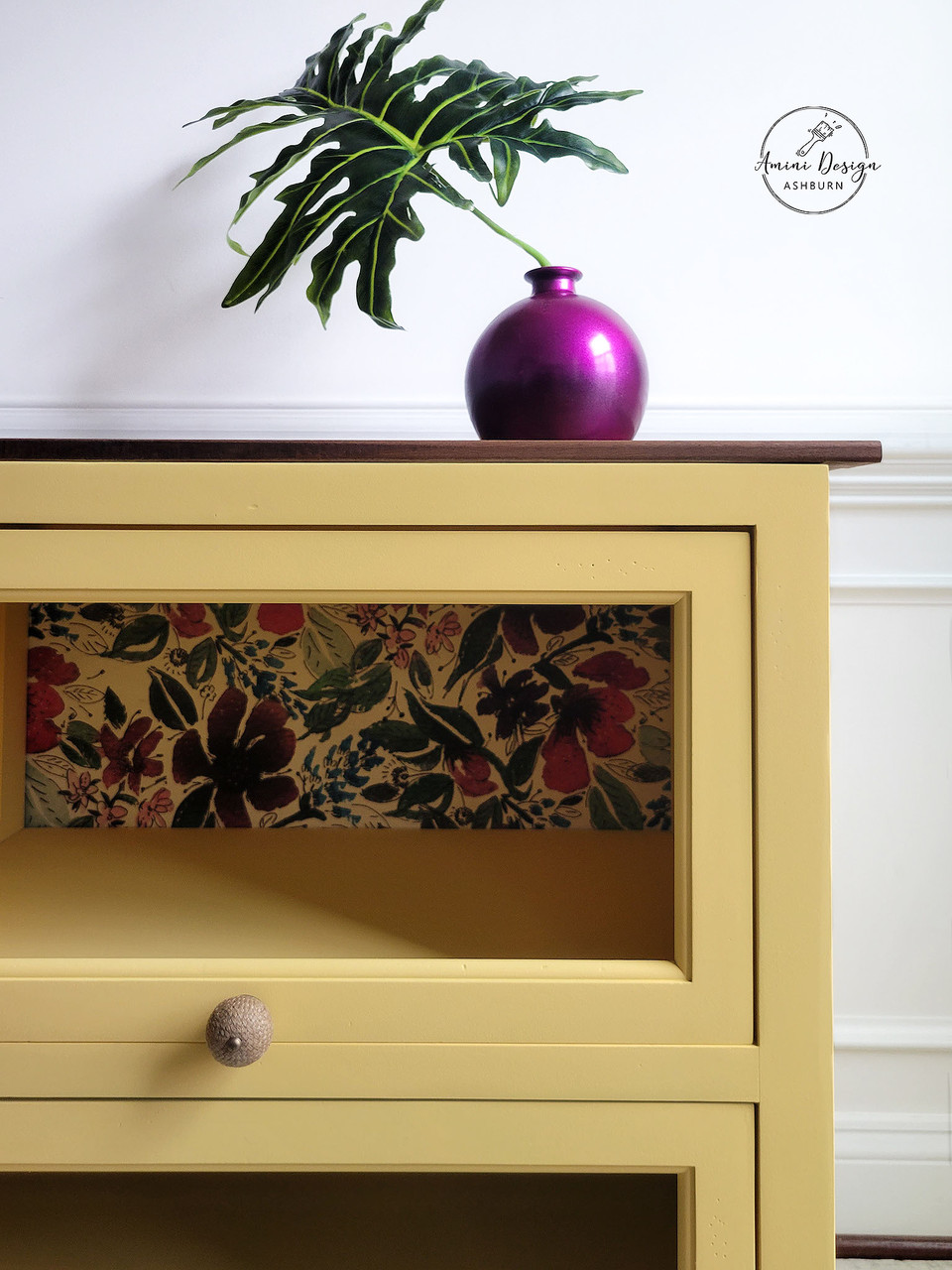
Yellow and Purple
These are complementary colors that create a visually stimulating and lively combination. The brightness of yellow is balanced by the depth and richness of purple, resulting in a well-rounded pairing.
Analogous Colors
Analogous colors (positioned next to each other on the color wheel) are pairs that are based on the same primary color. For example, red and orange, purple and blue, or green and yellow. Because the colors used in analogous combinations are similar, they are often used to create one unified mood: happy, calm, excited, etc.

Yellow and Orange
These two lively colors create a cheerful look that is sure to make you smile! This bright, warm hues radiate energy and enthusiasm.


Purple and Red
This harmonious pair is where luscious meets luxury. Red and purple are sure to give your space a rich, extravagant feel.

Green and Yellow
This harmonious pair is where luscious meets luxury. Red and purple are sure to give your space a rich, extravagant feel.


Blue and Green
This cool, tranquil combination brings the natural feel of outdoors, in.

Monochromatic Colors
Monochromatic color schemes are built from tints, tones, and shades of one single hue. For example: red, pink (red mixed with white), and burgundy (red mixed with black).


Color Palette Inspiration!
Using our knowledge of complementary, analogous, and monochromatic color pairings, we’ve put together a few combinations we love to help inspire your next room makeover or furniture flip:
Now that you’ve learned the basics of color theory, you might just be ready to start blending paint colors to create your own unique custom hues! Watch this video to learn how you can translate your color theory knowledge into masterful color mixing skills.


